
Wolseley Express
Product Listing Page Redesign for B2B Plumbing & HVAC
Jump to:
What I Did
-
UX design / Interaction design
-
Design sprint facilitation
-
A/B testing
-
UX research
-
Discovery sessions with business & users
Tools / Resources I Used
-
Figma
-
Miro
-
UserTesting.com
-
Baymard Premium
-
Medallia Customer Feedback
Team Members
-
Sharmily Senior Product Manager
-
Padma Product Owner
-
Christine & Chaithan Business Analysts
-
Wilson Junior Product Designer
-
Pooja UX Researcher
-
Danish Product Design Lead
Project Timeline
-
1.5 years as of 2025
TLDR
🎯 Business Objective
Increase share of revenue from Wolseley Express e-commerce.
✨ What I delivered through beautiful design
New design system and information architecture that removed friction from the path to purchase, and improved self service aspects of the website.
🚀 The result
E-comm revenue share went up 14.29% in 1.5 years.

A sizzle that I made for the redesign project.

What is Wolseley Express?
Wolseley Express ↗️ is an e-commerce website owned by Wolseley Canada Inc. (subsidiary of Ferguson PLC in USA), a leading plumbing and HVAC equipment distributor with 200+ branches across Canada.
4k
Av. Daily Users
400
Av. Daily Transactions
Jump to:
The Problem.
An aging e-commerce website with poor mobile usability and other major pain points hindering adoption.
In 2014, Wolseley Express was built as a self service e-commerce website in an attempt to reduce customer reliance on Wolseley's brick & mortar stores. This would potentially reduce operational cost for the company and increase sales. However as years passed, Wolseley Express fell into neglect, showing signs of aging, resulting in irritated customers and poor adoption rates.
With the onset of Covid-19, the company saw a sharp spike in online orders and e-comm adoption rate (for obvious reasons!) and once again decided to invest in their e-commerce platform. This involved a tech stack upgrade as well as a UX overhaul to ensure customers get the best experience and get hooked.
While the dev team took over the tech stack upgrade, I was hired to redesign the website with a modern look and to address customer pain points to improve adoption rates, thereby increasing the share of revenue generated through e-commerce.
Jump to:
Redesign Phase 1:
Path to Purchase
Categorizing the different pages helped us decide where to start with the redesign.
We targeted the path to purchase first as that would yield the most meaningful results. For this case study we're looking at the PLP / SRP.
.jpg)
Wolseley Express pages categorized by journey type
.jpg)
.jpg)
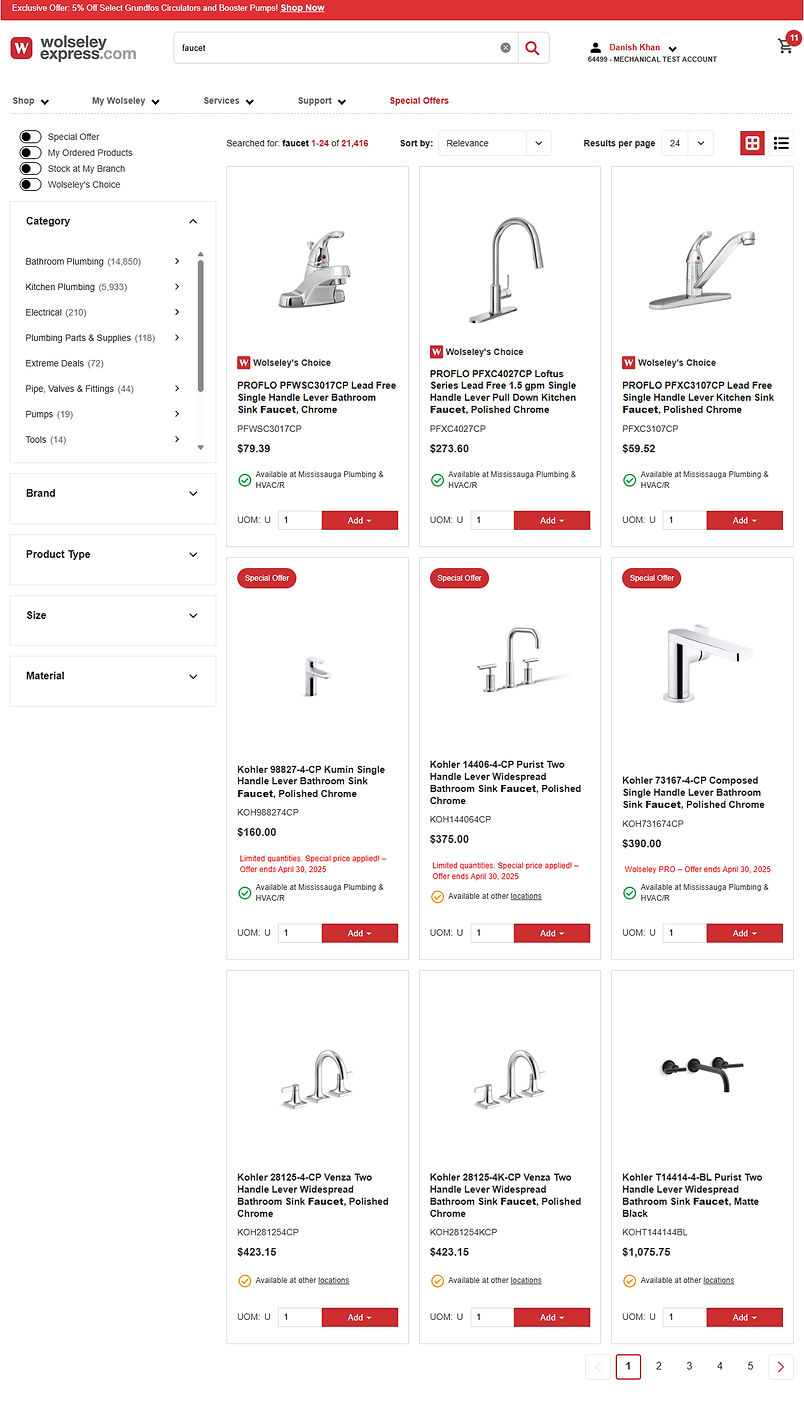
1
Product Tile Refresh
The existing product tile did not use space efficiently, and also lacked important information that customers had complained about in the past.
Key Improvements
.png)
Optimized Wasted Space
.png)
2
A Cleaner, More Economical Page Layout
This was probably the biggest departure from the existing design, and my biggest fear was complete rejection by the customers! However, it was well received by the customers as it directly addressed recurring usability complaints.
Before

After
.png)
3
An Enhanced Filtering Experience
I designed a new filter experience for the new layout. Based on countless user complaints, and usability tests, this update addressed major pain points and implemented UX best practices.
⚡New Filter Bar⚡
Before
Limited visibility of available filters
Users would need to scroll to discover more filters.

After
Immediate access to all available filters
Users get the full picture right off the bat, and can easily jump to the filter they want.

Sticky Filter Bar
Sticky filter bar is accessible any time

Filter modal gives access to all available filters in one place
⚡Improved Filter Pills⚡
Before
Filter pills lacked contrast, making them easy to miss

After
Filter count clearly displayed
The “All Filters” button shows count of filters applied.
Improved visual hierarchy and sufficient contrast for the filter pills.

4
Goodbye In-line Scroll!
During usability tests I noticed that the existing filter facets suffered from in-line scroll issues. Users wanting to scroll the page would unwittingly find themselves scrolling inside the filter facet, and this was more prevalent on mobile devices.
Before
Inline scroll introduces lack of overview
Users can see a maximum of 8 filter options at any given time, impacting scannability.

After

Truncation improves page overview and scannability
Giving users the agency to expand and see as many options as they want in a single view improves scannability.
5
Improved Scannability with the New Grid-view
I also fixed usability issues with the product grid where inconsistencies were hindering scannability.
Before

Poor scannability of price value
Since price does not display consistently in the same spot, this impacts the scannability of the product grid.
After

Consistently placed price improves scannability
6
Displaying Price Per Shipping Multiple
This pain point was raised regularly by customers and branch associates. Some products were priced by the foot but came in 12-foot multiples. Since the product tile only displayed the price per unit, the user had calculate the price per multiple on their own. When designing the new product tile, I addressed this issue by clearly displaying the price per multiple near the price per unit, giving customers a clearer cost indicator.
Before
Unclear and potentially misleading price
While some products are sold in 12-foot multiples, the listed price was shown only per foot, requiring customers to calculate the actual cost themselves.

After

Clearly displayed price-per-multiple
Gives the user confidence that they have the complete information for their purchase decision.
7
Clearer Sign-in Messaging
Wolseley Express only displays prices to signed-in users, while unauthenticated users can still browse without seeing prices. However, the product tiles didn’t indicate this restriction, which led to confusion and uncertainty for users. I fixed this problem by including clear messaging for unauthenticated users so they don't keep wondering why the price is missing.
Before

Missing pricing indicator created user confusion
Wolseley Express only displays prices to signed-in users, while unauthenticated users can still browse without seeing prices. However, the product tiles didn’t indicate this restriction, which led to confusion and uncertainty for users.
After

Reduced uncertainty by clearly displaying login message
The message now clearly addresses the fact that users need to be signed in to see price and availability.
8
Optimized for Mobile Use
Mobile phone users account for 44% of the traffic, which is significant. I prioritized mobile usability in all our designs to ensure the best experience.
.png)
The New Mobile Experience


Jump to:
Primary Research
I consolidated valuable customer insights that were scattered across different teams and tools at Wolseley.
Branch Associates
Dealing directly with customers on the daily gives branch associates a deep understanding of what the customers' needs and wants are.
eCommerce Sales Enablement Team
This team serves as the bridge between branches and the website. They communicate with both customers and branches daily and understand the friction preventing e-comm adoption.
Customer Feedback through Medallia
Medallia captures customer feedback and complaints across a wide range of surveys on the website. This gives us insights straight from the customer.
Major themes identified
1
Product availability is unclear
4
Website design feels incomplete at times, thereby reducing confidence
2
Price per shipping multiple can be misleading
3
Mobile usability is very poor
Scroll through some of the Medallia user feedback below


Usability Testing
Both UserTesting and Userlytics are amazing tools, and the best part about them is the user panel. You get to targeted audiences easily and receive feedback almost instantly.


The image above is from a different page of the redesign, but we had a similar approach for the PLP.
Secondary Research
This served as a source of UX principles and best practices that were relevant to B2B e-commerce
Baymard Premium B2B turned out to be a treasure trove of UX best practices and pitfalls to look out for. NN Group also played a big role in forming our design direction, and both of these sources ended up saving us a lot time!


UX Competitive Landscape
As part of the design sprint, we conducted extensive research to see what competitors and peers were doing. For each website we would then have detailed discussions and try to find elements that would suit our users' needs, and what mistakes we could learn from.

This is a snapshot from our design sprint. You can see each of our notes highlighting elements we liked, or didn't like.
Jump to:
Design Sprints
We conducted 5 day design sprints which involved the following:
-
Day 1: Goal setting
-
Day 2: Brainstorming & ideation
-
Day 3: Synthesize & vote
-
Day 4: Prototype
-
Day 5: Validate (present to business / test with real users)


The image above is from the Miro board we used for conducting design sprints.
Jump to:
Continuous Process Improvement
The dev team was talented and had a great attitude, but I noticed that they were not very familiar with Figma, and had not worked with a dedicated product designer in the past, which introduced some gaps in the process. This resulted in inconsistencies in the final work as they would often miss key interaction details.
I took some steps in an attempt to bridge these gaps, and introduced some changes to the process.
Figma Training Sessions
I conducted a number of training sessions for the dev team to bring them up to speed with common tools in Figma. This also gave me the opportunity to show them my approach to design which really helped us get aligned.
Detailed Design Annotations
I noticed the dev team needed some extra direction with key design and interaction details, so I began with adding more detailed annotations, at times maybe even over explaining certain things just to be sure that nothing gets missed.


UX Demos
To further streamline the development process, I asked the developers to demo the work they had done before they committed the code. This way we caught and rectified design issues early which in turn reduced the number of bugs that landed with the QA team.

Outcomes
E-comm revenue share went up 14.29% in 1.5 years.

Filter-related complaints through Medallia went down by 60.87%.